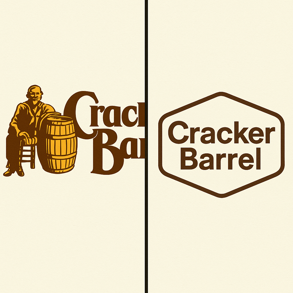
In a surprising but telling turn, Cracker Barrel has announced that it will be returning to its classic “Old Timer” logo after customer response to the recent redesign was overwhelmingly negative.
Just weeks ago, the company unveiled a simplified, modernized version of its branding—clean typography tucked inside a hexagon—that was intended to refresh the restaurant chain’s image. But what followed was a wave of criticism from loyal customers who felt that Cracker Barrel had walked away from the very nostalgia and authenticity that defined its identity.
The original logo—featuring the familiar figure of the Old Timer sitting beside a barrel—was more than just a piece of art. It embodied the comfort, tradition, and country-store charm that have drawn generations of families through Cracker Barrel’s doors. When the update stripped away that imagery, many longtime diners said the brand felt “unrecognizable.”
In its official statement, Cracker Barrel said it had “listened carefully” to customer feedback and recognized the deep emotional connection guests have with the original design. The company emphasized that while innovation is important, it must always be balanced with honoring tradition.
This reversal highlights a critical truth about branding: not every change is an improvement. For heritage-driven businesses like Cracker Barrel, nostalgia isn’t outdated—it’s the product. And when the brand tried to modernize, customers quickly reminded them that what they really wanted was authenticity, not abstraction.
So the Old Timer is back, and with him, a reminder that sometimes the best way forward is to stay true to the past.
When it comes to branding, timing matters. I’ve written before about how brand and logo updates can be a good thing when the moment is right, when the change is purposeful, and when it reflects genuine evolution. But with Cracker Barrel’s recent logo change and the broader design decisions surrounding it, the question must be asked: is this really the right direction for a company whose very identity is rooted in nostalgia?
Cracker Barrel has always been more than a restaurant. It’s an experience. The rocking chairs on the porch, the old-style country store, the checkerboards and the antique-laden walls—these things weren’t just décor; they were memory triggers, designed to remind us of a slower, more “simpler” time. The logo itself, with its warm rustic typography and iconic imagery, anchored that feeling. It wasn’t flashy, it wasn’t modern, and it didn’t need to be. It was the visual shorthand for “comfort,” “heritage,” and “home.”
So why change?
In recent years, many legacy brands have chased modernization, worried that younger audiences won’t connect with “dated” logos or interiors. Yet Cracker Barrel’s very strength was that it didn’t bow to fleeting design trends. Its “dated” look was the appeal. To change the logo to something stripped-down, simplified, and more generic is to cut off a piece of the soul that kept customers coming back.
The ripple effect of this change is even larger: it won’t just stop at the sign outside. A new logo often signals more to come—menu overhauls, interior redesigns, a pivot in the experience. But if Cracker Barrel loses the smell of cornbread, the warmth of wooden décor, the old-school country store charm, what exactly will separate it from any other roadside chain?
This isn’t to say brands should never evolve. But evolution for a nostalgia-driven brand like Cracker Barrel must be careful, subtle, and deeply respectful of its roots. Simplifying for the sake of “keeping up” risks alienating the very people who built the brand’s longevity.
The truth is, nostalgia never left us. People still crave it, especially in a world that feels faster and colder every year. That’s what makes this moment so strange. Instead of doubling down on what makes Cracker Barrel unique, the company seems to be walking away from it.
So while the new logo might be technically “cleaner,” it also feels emptier. And when the heart of your brand is memory and emotion, emptiness is the last thing you want.
Cracker Barrel’s charm was never about polish. It was about authenticity. And if the brand forgets that, the risk isn’t just a lost logo—it’s a lost identity.


